We have collected interesting trends of 2019 and trends of 2020 in the field of text content and website design and want to share them. Knowing them, you can check the compliance of the site with the latest trends. However, if you still have something “in the old way”, do not rush to remake everything in a new way. Trying to keep up with fashion, you can get so carried away that you can complete the redesign of the site by next year. And there will be a new trend for other colors, fonts, design app.
Bright colors vs pastel colors
This year, two mutually exclusive trends are immediately popular – bright colors and pastel colors. However, you can use both trends to your advantage. Bright color makes the object noticeable, and calm does not tire. Therefore, it is better to use “flashy colors” only where you need to stand out – in advertising, on the landing page, where users are rare. And use pastel colors in everyday use interfaces, so as not to bore or annoy the user. In particular, where maximum concentration and calm are needed. Restrained colors are perfect for the checkout page or entering credit card information.
Complex gradients and color filters
Complex gradients are gaining popularity. They are used as a background, as filters for photos, as elements of the design of advertising materials. This trend can be implemented on the site, as well as in banners and advertising in case it does not require a lot of time and money.
Large fonts
Large heavy headline fonts are popular this year. They attract attention well. However, do not abuse them, do not use them in the main texts. Use only emphasis.
Photorealism style illustration.
Detailed web art returns to web design. Drawings worked out to the smallest detail are again popular. Of course, they are not cheap, and before ordering them, make sure that it is really necessary.
If you really want to use the rendered image, but there is no budget for it, then you can select the image on the stock or process the photo with an art filter.
Combining photography and drawing
One of the interesting trends was the combination of photography and drawn elements. This opens up the possibility of a new use of stock images, which without additional processing may not be of interest to users, but when combined with a picture, they will create a feeling of something fresh and original.
Another technique is to combine images into a collage. Often people are more interested in just such images, since they can be viewed.
Asymmetry and geometry games
In 2020, asymmetric web design and unusual geometric shapes were popular. This trend is certainly good in order to attract the attention of the user, to make him move away from the familiar template. However, be careful. Asymmetry and unusual geometric shapes can cause discomfort and anxiety. The user will subconsciously try to restore symmetry. We recommend using this trend to emphasize, and adhere to unobtrusive classics in everyday use interfaces.
The image in the text should reflect its essence
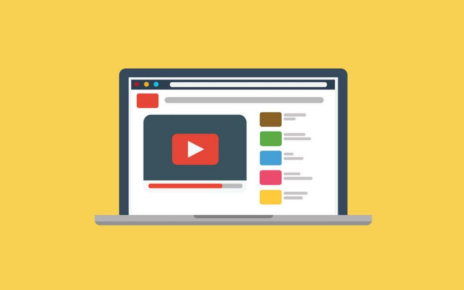
It’s better to place a real photo of the workflow, infographics, a graph, a live photo from social networks that make sense, and not just dilute the canvas of the text with an image.
If you don’t get away from stock photos, here are some tips:
Look through the search engine in how many materials this image has already been used. If too often, then look for another picture, if almost not, then take
Use stock image as background under text.
Apply filters and graphic design to the image, fantasize
Do not use cliches. For example, to display the workflow, select a photo that is closer to real life, let the shot be very different from the classic staging photo
Choose photos showing a bright detail, for example, instead of a full-length runner, put a photo of your fingers tying shoelaces:
- Refrain from using images with faceless men
- Choose photos with an emotional message
- Let people in the photo be in natural poses
Do not use stock images on the company page. Production photos with people from stocks will immediately look fake. Better take a photo of the workflow and colleagues on a good mobile phone.
Storytelling
People love stories. It seems that they are talking about it everywhere. But in practice they are written mainly in social networks and blogs. This trend reaches commercial sites slowly. You can tell stories about the company and the product.
The story about the company should be written in simple language and from the heart. We recommend:
- Tell us about the benefits you bring to customers.
- Tell your story as if you were telling a fairy tale. Do not forget about the plot, development and climax
- Write in living language and forget words like “effective”, “maximum”, etc.
- Pay attention to the features of the company and your products and services
- Post photos. Just don’t take them from photo stocks, let it be high-quality images from a photo shoot
- Put a call to action at the end
For the product history to impress the user, it must include:
- A hero with whom the reader can associate himself
- A hero who unfolds and changes towards the end of the story
- Emotions
- The effect of surprise (desirable, but not necessary)
- Conflict or problem
- Time and Place
- Hero who acts
- Logical ending
It is advisable that the story be based on real events. If a story is made up, it can sound like an advertisement and look artificial. If you do not have enough live materials, then organize a competition among customers and get a lot of ideas for inspiration.
Neural networks write texts for copywriters
Artificial intelligence is becoming smarter and can already write more or less meaningful texts. Soon he will be able to replace simple copywriting – create a description of the product, write a simple article, and even come up with the end of the story. You can play such a service right now. Porfirevich was used for the article. By the way, he came up with some not bad endings for this article.
Texts for interfaces will be created by UX writers
Previously, programmers came up with texts for interface elements, error messages, and forms. It happened that it turned out ridiculous. Not because programmers wrote incorrectly, but because they wrote for themselves and for other programmers. In their own language, not in the language of users.
Then the tests began to be written by designers, layout designers, technical writers, and after some time UX-specialists. Got better. But now there is a tendency to highlight front-end texts in a separate direction of content. Soon, usability agencies will offer a separate service for creating understandable texts for interfaces and involve UX writers in this work.
Information style
Articles in which 80% of the text is water and 20% of the benefit are not interesting to users. Such articles do not read out and quickly close. Search engines pay attention to this and do not allow such materials on the first pages of search results. Therefore, the information style, which primarily cares about the meaning, and not about the beauty of metaphors, gets more supporters.
Show reading time and number of readings of an article
A couple of years ago, a trend appeared to show the reading time at the beginning of the article. This is a good practice. Thus, the online edition shows its respect for the time of the reader. The user can immediately evaluate, read the article now or postpone for later.
The second trend is to show the number of views or readings of an article. Such information is useful in that it helps to filter out more readable and popular in the flow of materials.
Informative and truthful texts written in simple language will gain popularity in the coming year 2020. Users will get used to those sites where they show the time of reading the material and the number of views / readings.
The design will be dominated by bright colors to attract attention and muted colors for everyday interface elements. Headings will be in large print, and instead of photos, many use illustrations, collages and photographs combined with drawings.